details elementsummary elementa element to define a commandbutton element to define a commandinput element to define a commandoption element to define a commandaccesskey attribute
on a legend element to define a commandaccesskey
attribute to define a command on other elementsdialog elementdetails elementSupport: detailsChrome for Android 59+Chrome 12+iOS Safari 6.0+UC Browser for Android 11.4+Firefox 49+IE NoneSamsung Internet 4+Safari 6+Android Browser 4+Opera 15+Edge None
Source: caniuse.com
summary element followed by flow content.open — Whether the details are visible[Exposed=Window,
HTMLConstructor]
interface HTMLDetailsElement : HTMLElement {
[CEReactions] attribute boolean open;
};
The details element represents a disclosure widget from which the
user can obtain additional information or controls.
The details element is not appropriate for footnotes. Please see the section on footnotes for details on how to mark up footnotes.
The first summary element child of the element, if any,
represents the summary or legend of the details. If there is no
child summary element, the user agent should provide its own legend (e.g.
"Details").
The rest of the element's contents represents the additional information or controls.
The open content attribute is a boolean
attribute. If present, it indicates that both the summary and the additional information is
to be shown to the user. If the attribute is absent, only the summary is to be shown.
When the element is created, if the attribute is absent, the additional information should be hidden; if the attribute is present, that information should be shown. Subsequently, if the attribute is removed, then the information should be hidden; if the attribute is added, the information should be shown.
The user agent should allow the user to request that the additional information be shown or
hidden. To honor a request for the details to be shown, the user agent must set the open attribute on the element to the empty string. To honor a
request for the information to be hidden, the user agent must remove the open attribute from the element.
This ability to request that additional information be shown or hidden
may simply be the activation behavior of the appropriate
summary element, in the case such an element exists. However, if no such element
exists, user agents can still provide this ability through some other user interface
affordance.
Whenever the open attribute is added to or removed from
a details element, the user agent must queue a task that runs the
following steps, which are known as the details notification task steps, for this
details element:
If another task has been queued to run the details notification task steps for this
details element, then abort these steps.
When the open attribute is toggled
several times in succession, these steps essentially get coalesced so that only one event is
fired.
Fire an event named toggle at the details element.
The task source for this task must be the DOM manipulation task source.
The open IDL attribute must
reflect the open content attribute.
The following example shows the details element being used to hide technical
details in a progress report.
<section class="progress window">
 <h1>Copying "Really Achieving Your Childhood Dreams"</h1>
 <details>
  <summary>Copying... <progress max="375505392" value="97543282"></progress> 25%</summary>
  <dl>
   <dt>Transfer rate:</dt> <dd>452KB/s</dd>
   <dt>Local filename:</dt> <dd>/home/rpausch/raycd.m4v</dd>
   <dt>Remote filename:</dt> <dd>/var/www/lectures/raycd.m4v</dd>
   <dt>Duration:</dt> <dd>01:16:27</dd>
   <dt>Color profile:</dt> <dd>SD (6-1-6)</dd>
   <dt>Dimensions:</dt> <dd>320×240</dd>
  </dl>
 </details>
</section>
The following shows how a details element can be used to hide some controls by
default:
<details>
 <summary><label for=fn>Name & Extension:</label></summary>
 <p><input type=text id=fn name=fn value="Pillar Magazine.pdf">
 <p><label><input type=checkbox name=ext checked> Hide extension</label>
</details>
One could use this in conjunction with other details in a list to allow the user
to collapse a set of fields down to a small set of headings, with the ability to open each
one.
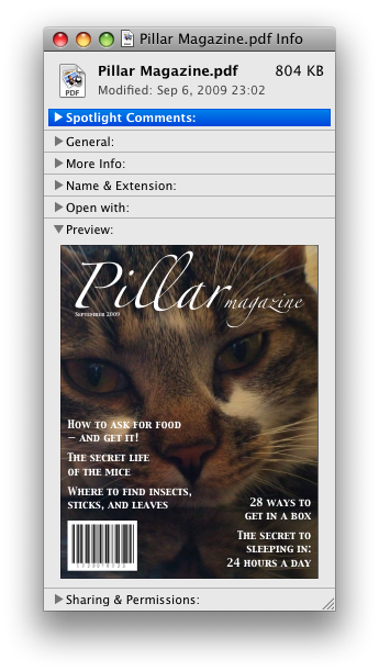
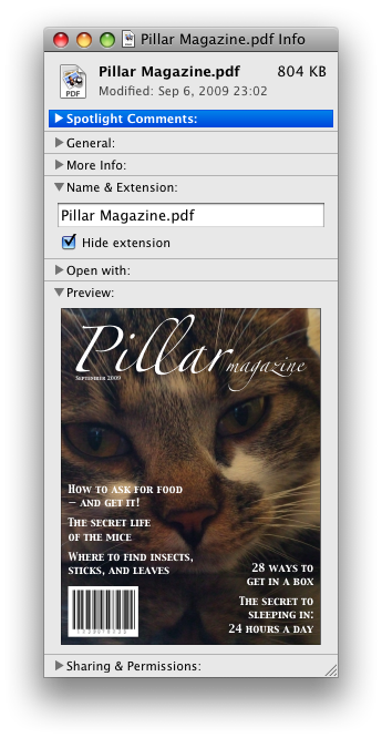
In these examples, the summary really just summarizes what the controls can change, and not the actual values, which is less than ideal.
Because the open attribute is added and removed
automatically as the user interacts with the control, it can be used in CSS to style the element
differently based on its state. Here, a stylesheet is used to animate the color of the summary
when the element is opened or closed:
<style>
 details > summary { transition: color 1s; color: black; }
 details[open] > summary { color: red; }
</style>
<details>
 <summary>Automated Status: Operational</summary>
 <p>Velocity: 12m/s</p>
 <p>Direction: North</p>
</details>
summary elementdetails element.HTMLElement.The summary element represents a summary, caption, or legend for the
rest of the contents of the summary element's parent details
element, if any.
The activation behavior of summary elements is to run the following
steps:
If this summary element has no parent node, then abort these steps.
Let parent be this summary element's parent node.
If parent is not a details element, then abort these steps.
If parent's first summary element child is not this
summary element, then abort these steps.
If the open attribute is present on
parent, then remove it.
Otherwise, set parent's
open attribute to the empty string.
This will then run the details notification task steps.
A command is the abstraction behind menu items, buttons, and links. Once a command is defined, other parts of the interface can refer to the same command, allowing many access points to a single feature to share facets such as the Disabled State.
Commands are defined to have the following facets:
User agents may expose the commands that match the following criteria:
User agents are encouraged to do this especially for commands that have Access Keys, as a way to advertise those keys to the user.
For example, such commands could be listed in the user agent's menu bar.
a element to define a commandAn a element with an href attribute defines a command.
The Label of the command is the string given by the
element's textContent IDL attribute.
The AccessKey of the command is the element's assigned access key, if any.
The of the command is true (hidden) if the element has a attribute, and false otherwise.
The Disabled State facet of the command is true if the element or one of its ancestors is inert, and false otherwise.
The Action of the command is to fire a click event at the element.
button element to define a commandA button element always defines a
command.
The Label, Access Key, , and Action facets of the command are determined as for a elements (see the previous section).
The Disabled State of the command is true if the element or one of its ancestors is inert, or if the element's disabled state is set, and false otherwise.
input element to define a commandAn input element whose type attribute is in
one of the Submit Button, Reset Button, Image
Button, Button, Radio Button, or Checkbox states defines a
command.
The Label of the command is determined as follows:
If the type attribute is in one of the
Submit Button, Reset Button, Image
Button, or Button states, then the
Label is the string given by the
value attribute, if any, and a UA-dependent,
locale-dependent value that the UA uses to label the button itself if the attribute is
absent.
Otherwise, if the element is a labeled control, then the
Label is the string given by the
textContent of the first label element in tree order
whose labeled control is the element in question. (In DOM terms, this is the
string given by element.labels[0].textContent.)
Otherwise, if the value attribute is present, then
the Label is the value of that attribute.
Otherwise, the Label is the empty string.
The AccessKey of the command is the element's assigned access key, if any.
The of the command is true (hidden) if the element has a attribute, and false otherwise.
The Disabled State of the command is true if the element or one of its ancestors is inert, or if the element's disabled state is set, and false otherwise.
The Action of the command is to fire a click event at the element.
option element to define a commandAn option element with an ancestor select element and either no value attribute or a value
attribute that is not the empty string defines a command.
The Label of the command is the value of the
option element's label attribute, if there is
one, or else the value of option element's textContent IDL attribute,
with ASCII whitespace stripped and
collapsed.
The AccessKey of the command is the element's assigned access key, if any.
The of the command is true (hidden) if the element has a attribute, and false otherwise.
The Disabled State of the command is true if
the element is disabled, or if its nearest ancestor
select element is disabled, or if it or one
of its ancestors is inert, and false otherwise.
If the option's nearest ancestor select element has a multiple attribute, the Action of the command is to pick the option element. Otherwise, the Action is to toggle the option element.
accesskey attribute
on a legend element to define a commandA legend element that has an assigned access key and is a child of a
fieldset element that has a descendant that is not a descendant of the
legend element and is neither a label element nor a legend
element but that defines a command, itself defines a command.
The Label of the command is the string given by the
element's textContent IDL attribute.
The AccessKey of the command is the element's assigned access key.
The , Disabled State, and Action facets of the command are the same as the respective
facets of the first element in tree order that is a descendant of the parent of the
legend element that defines a command but is not
a descendant of the legend element and is neither a label nor a
legend element.
accesskey
attribute to define a command on other elementsAn element that has an assigned access key defines a command.
If one of the earlier sections that define elements that define commands define that this element defines a command, then that section applies to this element, and this section does not. Otherwise, this section applies to that element.
The Label of the command depends on the element. If
the element is a labeled control, the textContent of the first
label element in tree order whose labeled control is the
element in question is the Label (in DOM terms, this is
the string given by element.labels[0].textContent). Otherwise,
the Label is the textContent of the element
itself.
The AccessKey of the command is the element's assigned access key.
The of the command is true (hidden) if the element has a attribute, and false otherwise.
The Disabled State of the command is true if the element or one of its ancestors is inert, and false otherwise.
The Action of the command is to run the following steps:
click event at the element.dialog elementSupport: dialogChrome for Android 59+Chrome 37+iOS Safari NoneUC Browser for Android 11.4+Firefox NoneIE NoneSamsung Internet 4+Opera Mini NoneSafari NoneAndroid Browser 56+Opera 24+Edge None
Source: caniuse.com
open — Whether the dialog box is showing[Exposed=Window,
HTMLConstructor]
interface HTMLDialogElement : HTMLElement {
[CEReactions] attribute boolean open;
attribute DOMString returnValue;
[CEReactions] void show();
[CEReactions] void showModal();
[CEReactions] void close(optional DOMString returnValue);
};
The dialog element represents a part of an application that a user interacts with
to perform a task, for example a dialog box, inspector, or window.
The open attribute is a boolean
attribute. When specified, it indicates that the dialog element is active and
that the user can interact with it.
A dialog element without an open attribute
specified should not be shown to the user. This requirement may be implemented indirectly through
the style layer. For example, user agents that support the suggested
default rendering implement this requirement using the CSS rules described in the rendering section.
Removing the open attribute will usually hide the
dialog. However, doing so has a number of strange additional consequences:
The close event will not be fired.
The close() method, and any user-agent provided cancelation interface, will no longer be able
to close the dialog.
If the dialog was shown using its showModal()
method, the Document will still be blocked.
For these reasons, it is generally better to never remove the open attribute manually. Instead, use the close() method to close the dialog, or the attribute to hide it.
The tabindex attribute must not be specified on
dialog elements.
show()Displays the dialog element.
showModal()Displays the dialog element and makes it the top-most modal dialog.
This method honors the autofocus attribute.
close( [ result ] )Closes the dialog element.
The argument, if provided, provides a return value.
returnValue [ = result ]Returns the dialog's return value.
Can be set, to update the return value.
When the show() method is invoked, the user
agent must run the following steps:
If the element already has an open attribute, then
abort these steps.
Add an open attribute to the dialog
element, whose value is the empty string.
Set the dialog to the normal alignment mode.
Run the dialog focusing steps for the dialog element.
When the showModal() method is invoked,
the user agent must run the following steps:
Let subject be the dialog element on which the method was
invoked.
If subject already has an open
attribute, then throw an "InvalidStateError" DOMException
and abort these steps.
If subject is not connected, then throw an
"InvalidStateError" DOMException and abort these
steps.
Add an open attribute to subject, whose value is the empty string.
Set the dialog to the centered alignment mode.
Let subject's node document be blocked by the modal dialog subject.
If subject's node document's top layer does not already contain subject, then add subject to subject's node document's top layer.
Run the dialog focusing steps for subject.
The dialog focusing steps for a dialog element subject are as follows:
If for some reason subject is not a control group owner object at this point, or if it is inert, abort these steps.
Let control be the first non-inert focusable area in
subject's control group whose DOM anchor has an autofocus attribute specified.
If there isn't one, then let control be the first non-inert focusable area in subject's control group.
If there isn't one of those either, then let control be subject.
Run the focusing steps for control.
If at any time a dialog element is removed from a Document, then if that dialog is in that
Document's top layer, it must be removed from it.
When the close() method is invoked, the user
agent must close the dialog that the method was invoked on. If the method was invoked
with an argument, that argument must be used as the return value; otherwise, there is no return
value.
When a dialog element subject is to be closed, optionally with a return value result, the user agent
must run the following steps:
If subject does not have an open
attribute, then abort these steps.
Remove subject's open
attribute.
If the argument result was provided, then set the returnValue attribute to the value of result.
Queue a task to fire an event named
close at subject.
The returnValue IDL attribute, on
getting, must return the last value to which it was set. On setting, it must be set to the new
value. When the element is created, it must be set to the empty string.
Canceling dialogs: When Document is
blocked by a modal dialog dialog, user agents may provide a user interface
that, upon activation, queues a task to run these steps:
Let close be the result of firing an
event named cancel at dialog, with the cancelable attribute initialized to true.
If close is true and dialog has an open attribute, then close the dialog with no
return value.
An example of such a UI mechanism would be the user pressing the "Escape" key.
A dialog element is in one of two modes: normal alignment or
centered alignment. When a dialog element is created, it must be placed in
the normal alignment mode. In this mode, normal CSS requirements apply to the
element. The centered alignment mode is only used for dialog elements
that are in the top layer. [FULLSCREEN] [CSS]
When an element subject is placed in centered alignment mode, and when it is in that mode and has new rendering boxes created, the user agent must set up the element such that its static position of the edge that corresponds to subject's parent's block-start edge, for the purposes of calculating the used value of the appropriate box offset property ('top', 'right', 'bottom', or 'left'), is the value that would place the element's margin edge on the side that corresponds to subject's parent's block-start side as far from the same-side edge of the viewport as the element's opposing side margin edge from that same-side edge of the viewport, if the element's dimension ('width' or 'height') in subject's parent's block flow direction is less than the same-axis dimension of the viewport, and otherwise is the value that would place the element's margin edge on the side that corresponds to subject's parent's block-start side at the same-side edge of the viewport.
If there is a dialog element with centered alignment and that is
being rendered when its browsing context changes viewport
dimensions (as measured in CSS pixels), or when this
dialog element's parent changes block flow direction, then the user
agent must recreate the element's boxes, recalculating its edge that corresponds to this
dialog element's parent's block-start edge as in the previous
paragraph.
This static position of a dialog element's edge with centered
alignment must remain the element's static position of that edge until its boxes are
recreated. (The element's static position is only used in calculating the used value
of the appropriate box offset property ('top', 'right',
'bottom', or 'left') in certain situations; it's not used, for instance,
to position the element if its 'position' property is set to
'static'.)
User agents in visual interactive media should allow the user to pan the viewport
to access all parts of a dialog element's border box, even if the
element is larger than the viewport and the viewport would otherwise not
have a scroll mechanism (e.g. because the viewport's 'overflow' property
is set to ).
The open IDL attribute must
reflect the open content attribute.
This dialog box has some small print. The main element is used to draw the user's
attention to the more important parts.
<dialog>
 <h1>Add to Wallet</h1>
 <main>
  <p>How many gold coins do you want to add to your wallet?</p>
  <p><input name=amt type=number min=0 step=0.01 value=100></p>
 </main>
 <p><small>You add coins at your own risk.</small></p>
 <p><label><input name=round type=checkbox> Only add perfectly round coins </label>
 <p><input type=button onclick="submit()" value="Add Coins"></p>
</dialog>